The Making of: PolicyMe's Accessible Rebrand
Insurance shouldn’t be a burden - it should be a breath of fresh air
.png)
Insurance shouldn’t be a burden - it should be a breath of fresh air

Lacks character and personality
Difficulty creating visual hierarchy
Minimal difference in font weight and styles
Using the same font for headings and body
Lato is a google font which is used by a multitude of companies

Too many colours being used - lot’s of blue, which felt very cold and hospital like
Primary CTAs should be the element that stands out the most
Difficulty understanding the most important content + what’s interactive
All interactive elements did not meet WCAG colour contrast requirements

Differentiating all of the products we were offering - no longer just term life insurance only
Every other corporation started to look the same as us
.png)
We drew inspiration from brands we admired, both within and beyond the insurance industry, exploring colors, illustrations, icon styles, and even finer details like border radiuses.

.png)

.png)
The findings above really began informing our discussions around who we wanted to be and what we wanted to represent. The brand expression comes to life through PolicyMe’s four design principles.

Modern and minimalist design for our webapp to create visual hierarchy and help the customer focus on the most important information
Remove all visual clutter and contrasting colours
Use colour very intentionally to communicate

Display real customer reviews and ratings
Refrain from using small or hidden print
Be clear and upfront about our processes
Organize our content and flows in digestible manners, using layman terms

Rounded corners and borders
Use real photography to showcase humans instead of blobbies
Warm, earthy tones to calm, ground and reassure our customers
Use micro-animations to delight our customers

We explored a range of color combinations, including pinks, purples, and blues, but ultimately centered our palette around green, creating harmonious shades that complemented it. This approach not only exceeded WCAG accessibility standards but also best captured the vision we aimed to bring to life.


We aimed for our logo to be a true reflection of our company’s values.


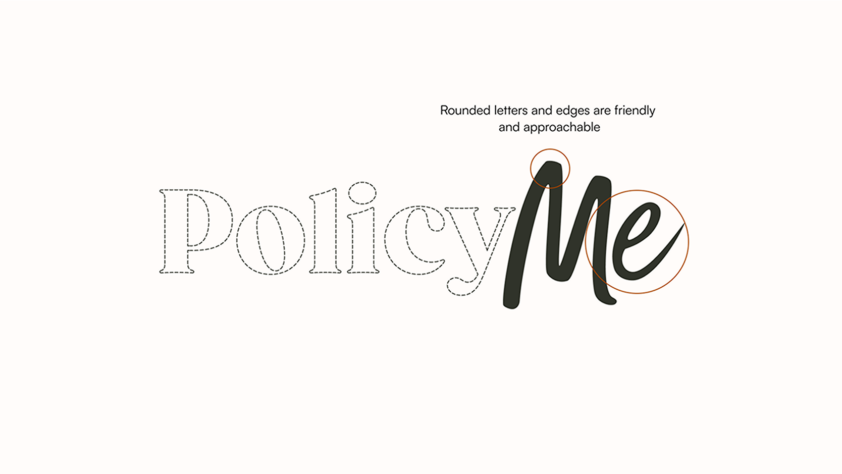

Previously, we used 1 font for both headings and body and it lacked a ton of character. We wanted our heading font to resemble our logo to maintain cohesion and we wanted out body font to be slightly more rounded to add to the approacable feel we were going for.

As we delved into the nuances of our visual identity, we realized we were treading a familiar path—one that felt overused by other companies. Many of the examples we explored featured oversized figures and a generic, corporate aesthetic that lacked the distinctiveness we were aiming for. Our previous design elements were easily replicated by other companies, prompting us to dive deeper into competitor research to understand how others in the insurance industry were approaching their branding.

Inspiration research we conducted felt overly used by various companies.

An insurance company operating under the name Insurance Uncle replicated our phone mockups in their entirety, including the use of our original characters.
This ecosystem is meant to reflect growth, innovation and protection

I wasn’t directly involved in the accessibility aspects of the redesign, such as screen reader capabilities and ARIA labels, but I supported the UI design of the components and provided feedback when needed. I also researched design systems like Material UI for inspiration and to identify opportunities to adapt existing components. While I’m not an expert, I have a working knowledge of accessibility standards.
Branding: Improve accessibility (e.g., PM light blue with white, CTA contrast).
UI Components: Ensure proper states, sufficient color contrast.
Code: Add labels to inputs, enable full keyboard navigation, provide alt text, and properly tag headings/links.
PDFs: Ensure screen reader compatibility (e.g., contracts).
Audit all digital content for WCAG 2.2 gaps
Update to Level AA compliance
Establish processes for ongoing accessibility
PolicyMe ensures WCAG AA compliance and minimizes legal risk
Large companies (e.g. CIBC) are comfortable partnering with us and whitelabeling our experience as theirs due to it being an accessible experience
Beyond accessibility, we aimed to be intentional with the UI design of our components, aligning them with our rebrand principles: simple, honest, caring, and approachable. To achieve this,
we rounded all components for a softer, more inviting look
used a single color for all interactive elements to maintain focus on key information.
We leveraged Figma variables to create scalable and responsive components and elements such as spacing and responsiveness.
.png)
.png)

I've always been passionate about creating inclusive experiences, believing that products should be accessible to all users. While I wasn’t deeply involved in the technical aspects of accessibility, designing accessible components and sections was a valuable experience.
Navigating constraints has strengthened my ability to find solutions through problem-solving. Balancing challenges like time, budget, resources, and deadlines has taught me how to prioritize effectively and make things happen despite complexities.